From dull and dated to our dream Hamptons inspired shaker kitchen - we're sharing our full kitchen renovation process with appliance details, finishes and everything inbetween. Take a look at the before photos in part one.
People often say that the kitchen is the heart of the home - and for me, that's definitely true.
For me, there's nothing better than a kitchen and dining room filled with loved ones. Whether it's a catch up over coffee and cake where the house is filled with laughter, or a birthday celebration where lunch spills over into dinner and the evening is finished with cake.
So far, I've showed you the before part of our Hamptons Inspired Kitchen Renovation - and now I get to share my favourite bit.... the after.
This kitchen was a huge project. It took months of time and lots of planning - and there were plenty of tears along the way - and whilst we can't share it with loved ones during lockdown, it's ready and waiting to share with friends and family and we have plenty of seats around our table.
So let me finally share the kitchen with you! >>
One of the reasons I fell in love with our house when I first saw it (literally whilst looking at the house next door and not knowing our home was even for sale!) was because it had the Hampton's vibe I'd always dreamed of.
You see, the first time I'd gone to Louisiana to meet Jesse's family, I noticed a gorgeous white wood clad house on the way to his Mom's house.
It had big windows with square details, a stunning porch with chairs to stop and rest and pretty manicured garden beds with hedges.
So I did what any fiance would do... I told Jesse I wanted it 😅 But we knew we'd likely never live in Louisiana and we knew we'd buy a house in Sydney where the houses didn't tend to look like that.....
But fast forward a few years and you'd find me looking longingly at our house telling Jesse it was my dream house and so unfair (what a drama queen)... not knowing that by Monday morning, I'd be booking a private inspection and would be making an offer on that dream house.
Unfortunately, the inside of the house didn't match the outside. The kitchen was dated and squished and just didn't work for our lifestyle - so it was the first thing on our to-do list.
I wanted to bring the Hamptons vibe from the outside in, which meant significant changes needed to be made.
The cracked and loose terracotta look tiles needed to go and as I knew there were original cypress pine floorboards hiding below, I decided I wanted to make them a feature.
Imperfect and traditional, I knew they'd balance the newness of the kitchen and bring some warmth and character to the house, so they were the first piece of the puzzle to play with.
I also knew I wanted white shaker cabinetry - but trying to avoid a stark white kitchen I decided I'd add in some colour with a navy island and warm grey stone bench tops.
The idea was to create a coastal, Hamptons vibe that still felt homely and welcoming - with plenty of room for entertaining.
We'd already purchased a 3 metre long dining table, so we knew we wanted the island to be a similar size, designing the kitchen around the 3.1m x 1.1m centrepiece.
Originally the island was 1m wide, however, when I found my dream sink (a massive 615mm x 510mm SilGRANIT Blanco sink) I pushed out the width to make sure there was plenty of room to sit opposite it.
For the appliances and details, I decided to go with black to add a modern touch and bring the space together.
From the coffee machine and kettle to the oven, tap and handles, everything was black - except the fridge.... and that was an intentional choice.
Wanting a double door fridge, I opted for stainless steel to break up the black so the kitchen didn't end up feeling too cluttered and the black wasn't overdone.
On the kitchen side of the island I added plate drawers (one of my favourite features!) and the dishwasher was tucked away next to the sink with built in bins hidden on the right.
Whilst the trend is definitely to have as many drawers as possible, I looked at what I needed to store in the kitchen and decided to have just 2 sets of drawers - one on the island for cutlery, plates and tupperware and one under the cooktop where we'd hide cooking utensils, pots and pans.
Next to the fridge is a large and deep pantry where all of our food is stored, with a double set of cupboards set next to the garage entry where we could keep all of our appliances and entertaining crockery.
These cupboards are actually the original pantry cabinets from the kitchen with new doors and tops added to match the new cabinetry. This saved us $3000 (insane and definitely something I'd recommend looking at) and gave us so much extra room.
For the stovetop, I knew I wanted a 90cm gas cooktop, but I wanted one that could hold as many pots and pans as possible.
I ended up choosing a Bosch cooktop with 5 burners that are arranged so every single one can be used at one time - even with a large pot at the centre.
Details: Bench Top | Stove Top | Kettle | Coffee Machine
Of course, as someone who loves having friends over for coffee or tea, a coffee machine was high on my list of wants.... especially because at the time I was a coffee fiend (but then our little guy came along and pregnancy made coffee sound repulsive at the same time as we were installing the coffee machine 😅).
We ended up going with a Breville machine as I wanted to be able to grind my own beans and make frothy lattes 😍
Now I just have to wait for lockdown to be over so I can have friends over for coffee!
Apparently my oven is the thing that surprises most people because it's just a standard size - but there's a reason for it.
Whilst initially I had my heart set on a 90cm oven, I only wanted a wall oven and didn't want the oven under the stovetop (mainly for safety reasons) so I compromised with a 60cm Fisher and Paykel oven that fits up to 6 trays and has a larger internal space than most 60cm ovens.
We also decided to skip a built in microwave and opted for a microwave cabinet instead. This was so much cheaper and means we won't have the issue of struggling to find a replacement when the microwave breaks later on as it's a standard sized cabinet.
Details: Bench Seating | Bench Top | Pendants
For our island, I chose brown leather bench stools that picked up the warmth of the wood floors and balanced the crisp whites and deep navy of the island bench.
Our dining table is white and wood with white seating so the brown leather seats and matte black legs of the bench seats were the perfect balance.
The bench top we ended up choosing was Quantum Quartz' Leggero and whilst I think it works pretty well with the space, I don't know that I'd recommend it as it shows up every mark and smudge and isn't as easy to maintain as my original choice (Caesarstone Clamshell).
For the splashback tiles, I wanted to add some detail without making the cooktop area look small and cramped - so I decided to go subtle.
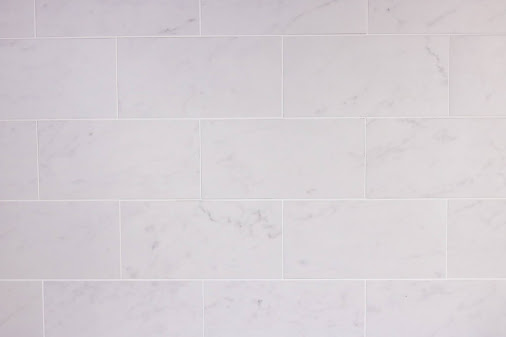
These 100x200mm Carrara Marble Subway Tiles were laid in a brick pattern with white grout to add a little bit of pattern and colour without overwhelming the space.
Because the splashback area was small, I went for the smaller tiles to create an illusion of space - rather than the thinner tiles that would end up making the space look smaller as there would have been less repetition of pattern.
Details: Bench Seating | Bench Top | Oven | Microwave | Fridge
I knew exactly what handles and knobs I wanted - but struggled to find the perfect ones.
Originally I'd chosen some from a specialty store but they were sold out with stock months away so I ended up at Bunnings - and surprisingly found the perfect ones!
The sink is possibly one of my favourite things in the whole kitchen and is a Blanco SILGRANIT sink. Unlike a traditional porcelain or ceramic farmhouse sink, this sink is super durable and does not mark or stain and cannot be chipped.
I cook with tomatoes all the time and was worried about staining, but a simple swipe over with some Jif is all it takes to remove any colour.
We chose not to undermount it to protect the stone and simply had the stone benchtop cut to fit the sink insert.
For the range hood, I wanted something that was completely invisible.
I hated that most concealed rangehoods still needed to be opened with a drop down flap whilst cooking, so I opted for this Ariston Undermount Rangehood that is simply turned on with the press of the button.
The only downside is that it's very loud - but it's also incredibly effective. If you have it on high and have a piece of paper laying on the bench, it sucks that piece of paper straight up - and we can now cook steaks or any food that smokes inside with no smoke filling the kitchen because it's sucked straight into the extraction fan and outside.
And there you have it! If you've stuck with me for this entire post, well done! This was a long one - but so many of you have been waiting for it and there is so much to share!
I think renovating the kitchen taught me a lot of lessons... but I'm glad it's done and I'm glad our home now looks more like our home.
Hopefully I've included all of the details you need - but if there's anything I have forgotten, please don't hesitate to ask!
This kitchen was completely paid for by us. Every appliance, every tile, every cabinet all came out of our pockets and was not funded by the blog so this is our very honest real life experience!
Because I've gotten so many questions, I might do a follow up post with some of the lessons we learnt throughout the renovation and share my tips for anyone planning their own.
Kitchen Contractors:
Builder: Kerrarn Builders
This post may contain affiliate links. As an Amazon Associate I earn from qualifying purchases.


No comments:
Post a Comment
There is nothing better than reading your comments on our posts! Let us know what you think of this post!